Data visualization tools are becoming essential. There is just no way around it.
It may not seem that way when we are sitting in front of our laptop. But if you’re wondering why is data visualization so critical, let’s put things into perspective.
DOMO publishes research each year about the amount of data that is created. Here is what they said about 2020:
Over 2.5 quintillion bytes of data are created every single day, and it’s only going to grow from there. By 2020, it’s estimated that 1.7MB of data will be created every second for every person on earth.
That is around 2.5 million terabytes, or 2.5 billion gigabytes, every single day. This number is only growing as the global population is growing and more and more people are connected to the internet.
You know by now that your business is generating huge amounts of data about your potential customers. But is hard to make sense of them when you get daily several gigabytes of new information.
What if you take all that data and visualize them to clearly see where there are new opportunities or where it seems that you business is leaking?
This is where data visualization tools come in.
What Are the Best Data Visualization Tools?
Below you may see some of the best data visualization tools that will help you understand your data. Sure, it may seem that Excel of Google Sheets is enough, but you will very quickly discover that they are many limitations and it is just not possible to combine various data sources in the way that visualization tools can.
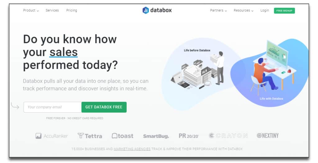
Databox
Main Features
Databox offers data visualization solutions designed for companies and agencies. It has multiple dashboard templates integrated with popular tools. Among them are Google Analytics, Facebook Pages, or LinkedIn Company pages. Using Databox, you can better predict and improve your performance in delivering results for stakeholders or clients.
Databox is one of the best data visualization tools out there. It comprises numerous types of business dashboards, integrations, as well as options for calculating and tracking metrics or goals. You can set it up to keep KPI scorecards or deliver KPI alerts on both desktop and mobile.
Databox is user-friendly and intuitive. It helps you easily visualize and analyze your data in one highly efficient platform. It doesn’t require any complicated code and delivers performance tracking and analysis through uncomplicated one-click options and over 70 integrations.
Features include:
- multiple options for building your own dashboards
- over 200 dashboard templates
- over 70 dashboard integrations you can set up easily
- data integration via SQL database
- API
- options for setting up custom metrics
- drag and drop metrics
- goals, alerts, and scorecards for tracking performance
- desktop, mobile, and TV apps
All in all, it’s one of the simplest and most efficient business analytics tools out there. And, if you’re looking for a free data visualization tool, you get that too.
Pricing
The free version of Databox offers 3 data sources, access to 3 users, and the possibility to set up 3 data boards. The data refresh interval is daily and you can use it to integrate up to 11 months of historical data.
The $49/month Basic version of Databox is designed for 10 users. The $99/month Plus version offers additional data calculations and data integration options. The $248/month Business version is designed for 20 users and 50 data sources while offering unlimited integration of historical data.
Zoho Analytics
Main Features
On the topic of best data visualization tools, we can’t skip Zoho Analytics. The tool’s 2 million users are a testament to its quality.
With Zoho Analytics you can centralize and analyze data from any type of source. Be it data from databases, flat files, web feeds, or online/offline applications. You don’t even need to remember to sync your data. It’s automatic. It can also be scheduled periodically depending on your specific needs.
Overall, Zoho Analytics is very intuitive and offers numerous options and features. Uploading data from any type of file, feeds, or drives is simple. Once your data is up, you can start visualizing your business’ performance in the form of charts, pivot tables, or widgets.
As for analyzing it, just use the drag and drop interface to build dashboards and issue reports. This data visualization tool is great for getting in-depth analytics about key metrics and valuable insights into performance.
Zoho also has easy to use data alerts and data sharing and collaboration features, as well as an AI assistant. On top of that, it is very secure and offers multiple access control options.
Pricing
Zoho is not a free data visualization tool. However, it does have a 15-day free trial.
It also has 4 types of paid plans ranging from $26.89/month to $543.88/month with the most popular version being the $136.89/month plan.
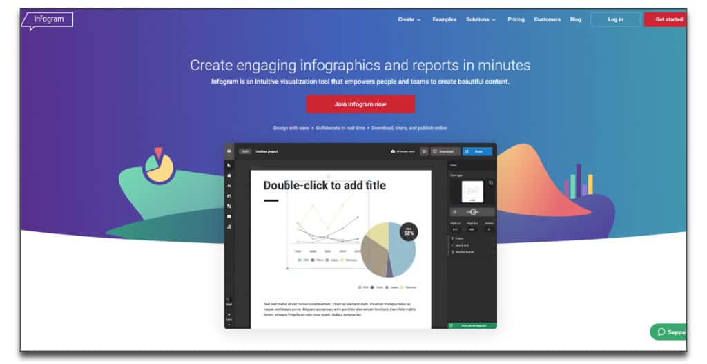
Infogram
Main Features
If designing is not your forte, Infogram has your back. It’s the best data visualization tool for chart builders struggling with inspiration. Infogram has a great collection of cool-looking templates and even an option for building custom templates with your own brand colors, fonts, and logo.
This data visualization tool also provides interactive content through animations and clickable legends and tooltips. The interface is intuitive and has a lot of sharing and collaboration features. There are also options for setting up user groups with different permission levels.
If you find yourself overcomplicating a chart and wanting to return to an earlier version, Infogram has simple restore options. On top of that, you can also track how well your charts perform with average on-screen rates and insight into how often they were shared.
Any content you create with Infogram is highly responsive on websites and various devices. And it even has a WordPress plugin and a photo library for your Facebook, Instagram, and Twitter content.
Pricing
The basic Infogram plan is free of charge. You can use it for up to 10 projects. Paid plans range from $19/month to $149/month billed yearly.
Tableau
Main Features
If you’re looking for an end-to-end analytics platform, you’ll want to check out Tableau. It’s a data visualization tool that will help you get the most out of your data, especially if you have some familiarity with SQL.
Tableau offers tailored, role-based licensing. This means that you can share access to different team members depending on their skill levels and responsibilities. For example, a Creator can design and curate data sources as well as create dashboards. An Explorer can analyze that data or create their own dashboards. And finally, a Viewer can see and interact with dashboards and visualizations.
On top of the Tableau Desktop option, you can also choose to keep and manage your data on Tableau Server or Tableau Online. With Tableau Server, your data is stored on-premises or on a public cloud, while with Tableau Online all your data will be on a dedicated cloud.
Tableau also features:
- advanced data visualization options
- a mobile app for analysis on the go
- intuitive sharing and collaboration tools
- drag and drop visualization tools
- AI-driven statistical modeling
- secured user access
Pricing
Depending on your needs, you can choose from several pricing options. Tableau for individuals is $70/user/month. For teams and organizations, you can get access to Tableau Creator for $70/user/month, Tableau Explorer for $35/user/month and Tableau Viewer for $12/user/month.
ChartBlocks
Main Features
When it comes to simple and easy to use data visualization tools, ChartBlocks takes the cake. Forget minutes. With ChartBlocks you can build data charts in a few seconds. It also has great data importing options and support. Just a few clicks and your databases, spreadsheets, or live feeds are up and ready for analysis. An option to schedule imports is also available.
ChartBlocks also has a Wizard to help you choose the right data for your charts and awesome customization and design options. Data or chart sharing is completely uncomplicated and the charts you create with ChartBlocks are highly responsive and usable on any device and screen size. There’s also an integrated option for sharing charts on Twitter, Facebook, as well as your website, or other social media.
Pricing
As for pricing, ChartBlocks is a free data visualization tool. In addition, it has two paid versions. The Professional plan is $20/month and offers 500,000 monthly views. The Elite plan offers 2.5 million monthly views for $67/month.
Plotly
Main Features
With over 2 million users, it’s safe to say that Plotly’s Dash is the most popular open-source data visualization tool. It lets you build machine-learning apps in Python, R, Node, and Julia.
Although it does require more technical skills, Plotly is also very intuitive and has numerous deployment options. Plus several high-quality visualization and analytics tools.
Additional features include:
- options to set up multiple teams and add team members
- customizable dashboards
- streamlined sharing and collaboration tools
- interactive reports and simulation modeling
Pricing
The use of Plotly’s MIT-licensed open-source data visualization libraries (Dash, Plotly.py, Plotly.js, etc.) is totally free. Dash Enterprise and Chart Studio are commercial offerings and they will set you back $840/year/user.
Datawrapper
Main Features
Datawrapper knows smartphones are taking over the world. Or maybe they have already. Anyhow, Datawrapper is focused on delivering the best experience to users on mobile devices. The performance analysis content you create with this tool is automatically adapted to be fully responsive on any type of device or screen size.
In addition, Datawrapper requires no code skills and has an intuitive design that will have you creating amazing charts and tables in no time. You also get assistance every step of the way to make sure your data and your designs match your vision. In the end, all you need to do is click “Publish”. And, you’re done.
It works just as well with any type of system (Linux, Mac, or Windows) because it is online and needs no installation or updates. It also has amazing templates based on data visualization best practices and customization options to integrate your own brand. On top of that, your content is easily accessible from anywhere and any changes you make are automatically saved.
Content is easily exported as HTML, PNG, PDF, and SVG.
Pricing
Datawrapper’s basic plan is free. You can use it to create unlimited charts and tables and export them in PNG. The Custom version is $610/month. There is also an Enterprise version that you’ll need to contact them to get pricing on.
Visually
Main Features
Visually offers a different solution to data visualization. To help you create high-impact content, they have a simple three-step system. First, you need to fill out a brief describing what type of content you need. It can be anything from videos to ebooks, infographics, reports, interactive websites, and more. Then, Visually pairs you up with creative talent that can deliver your desired content. You get access to over 1000 data journalists, designers, and developers.
After you complete the first step, you move on to the feedback and review stage. With assistance from Visually, you fine-tune the content and then you are ready for step three – launching and promoting.
Unlike other data visualization tools, Visually doesn’t require any tech skills. All you have to do is map out what you need and how you want to structure your content and then let professionals do the rest.
Pricing
Visually has a free community content gallery. They also offer paid plans, quoted depending on the client’s specific needs.
FusionCharts
Main Features
FusionCharts is one of the best JavaScript-based data visualization tools for creating simple but impactful content. It is available for desktop and mobile and can handle simple or complex data depending on what you need. You can create dashboards with FusionCharts and get access to over 100 chart and graph templates, as well as over 2000+ choropleth maps.
You can easily create time-series, IoT, or stock market charts with multiple data points and you can also export or share your content and entire dashboard in no time.
Other features include:
- a large charting library
- raw data extraction from multiple databases
- interactive and customizable dashboards
- intuitive options for issuing reports
- options for relational display and visual discovery
- continuous assistance through API and cross-browser support
Pricing
FushionCharts has three paid plans and a customizable Enterprise plan that is quoted individually. The paid plans range from $499/month to $2,499/month.
Chart.Js
Main Features
Chart.js is the ideal open-source data visualization tool. It is straightforward and intuitive and great for developers and designers looking for a tool with primary data visualization features. It’s as flexible as it is easy to use and, best of all, it’s free.
Chart.js’s JavaScript charting library is well structured and adaptable depending on your project’s requirements. You get 8 chart types to choose from, as well as options for adding animation and interactive features. The content you create with Chart.js is fully responsive on multiple browsers and mobile-friendly.
While it may not be as diverse as other data visualization tools, Chart.js is highly functional and great for simple projects that will make a big impact.
Pricing
Because it is a community-maintained project, Chart.js is free and open-source. However, any contributions you want to make to keep the project rolling are welcome.
What is Data Visualization?
In simple terms, data visualization is a graphic representation of data. If you read the beginning of my post, we discussed that there are over 2.5 billion gigabytes of new data created each day.
This includes new posts, comments, pictures, data from weather satellites, shopping behavior, and much much more. Everything that we do produces some kind of data, and the amounts of the ones that we need to store are staggering.
Even with the most basic of the data sets, you would need a visualization.
You are making a pie-chart from your excel data, or maybe you are using Google Analytics to see the trend in your daily visitors count. And in both cases, we are talking about just a couple of rows, columns, or altogether a couple of hundreds of cells of data.
What if you have thousands of tenth of thousands of data points that you need to somehow get across to another person, so they understand what you are trying to say?
Or maybe you are trying to organize your business data in a way that will allow you to see your business from a different angle and therefore give you a new perspective on things.
Data visualization allows you to see hidden insights and predict trends. You may for instance notice that previously unrelated data sets are correlated and therefore interconnected.
Imagine that instead of looking at 5 sheets of rows and columns, you are looking at one picture which clearly illustrates where the bottleneck or an opportunity is.
The implications for your business may be huge.
Types and Examples of Data Visualization
Let’s go over some of the basic visualizations structure that help us to understand the data that we receive and interpret them in a way that is helpful for our future progress.
Bar Chart
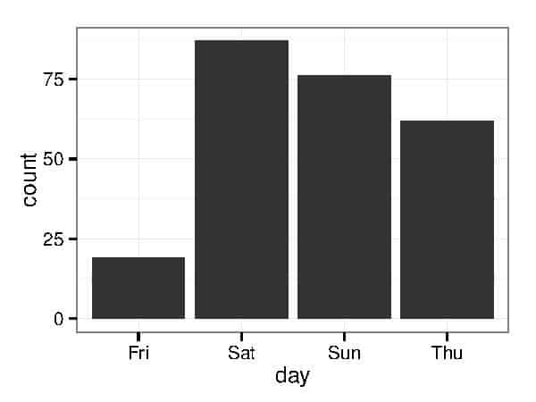
The basic variant of data visualization that we all know. Two axis, with two sets of data.
Scatter Plot
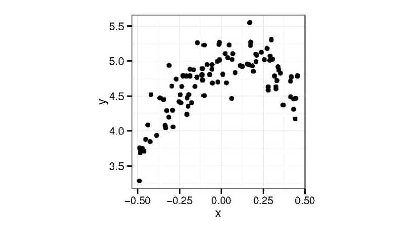
Shows two variables for a given set of data. Through this visual distribution, it is easier for you to spot trends.
Network
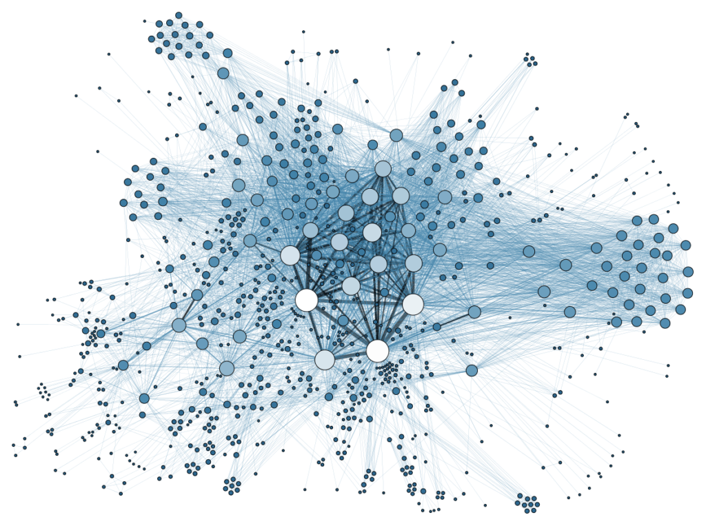
This helps you to see connections between various data points. With this visualization, it is easier to find dominant points or the point with the most concentration.
Pie Chart
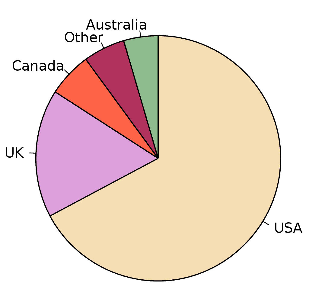
One of the business classics, a great and simple way to visualize how big something is, or how it is distributed.
Line Chart
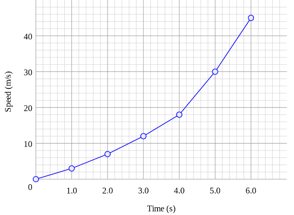
A great way to visualize trends. Growth, decline, stagnation is perfectly seen in this type of chart. Also goes well when trying to correlate with other data sets.
Stream Graph
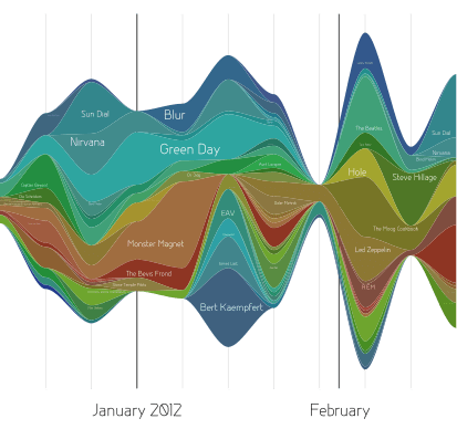
Ever wondered how line chart would look like if it went to the gym? Yeah…Stream graph is able to show you expansions of the lines in time. Notice that it is also able to operate with multiple data strings.
Treemap
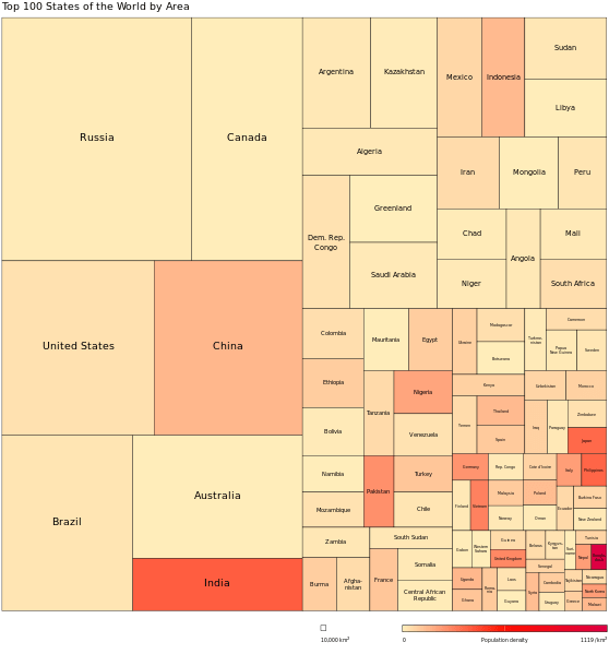
If you need to visualize hierarchical data – this is the way to go.
Gantt Charts
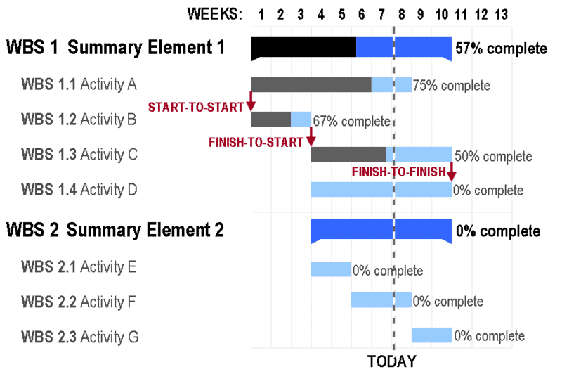
A perfect way to visualize a project timeline. Or when gathering big data you can also track ending and starting events as they move in time.
Heatmap
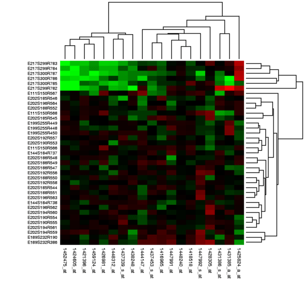
A great option when you need to visualize trends that can not be described with a simple line.
Stripe Graph
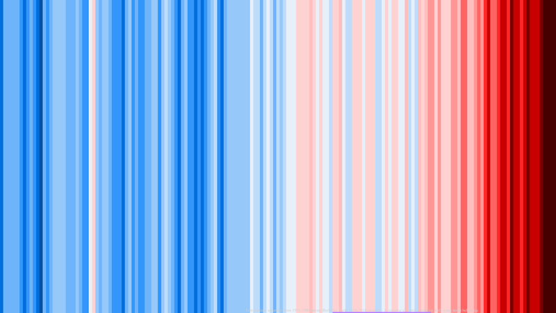
This is a cool example illustrating below and average ice temperatures in time. The goal of this graph is to show that the globe is warming up.
These are some of the most popular ones, there are of course more variations oif how you can visualize your data.
Imagine how difficult would it be to assess or explain the huge datasets that can be compiled into one simple picture that explains it all.
Why Do You Need Data Visualization Tools?
Everybody can do a piechart in Excel, so why do you need a special data visualization tool? Two reasons:
- Save Time ( = Save money).
- Create visuals that you can’t do yourself.
While 1. is important, 2. is critical. You do not know what you do not know. This is also referred to as “unknown unknown”. Data visualization tools help to solve this.
The goal of any visualization is to present the data in a way that will make you understand it and draw conclusions. What if your pie chart will not be sufficient? Maybe it is not completely clear, or you just miss a piece of information that would be critical to your further development
Let’s have a look at some examples that you can get with data visualization tools with just a few click.
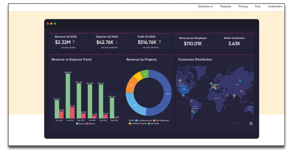
Databox
This service offers you a wide variety of integrations and interestingly – a lot of dashboard templates that look like this:
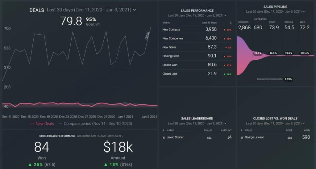
Here we see just a simple integration with Hubspot, but there are many more options to visualize your data. More importantly, there are these varieties of dashboards that help you to have a high-level view of your data so you can see a bigger picture.
Zoho Analytics
Another great example is Zoho analytics, which comes as a direct contender to Databox.
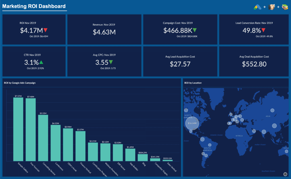
This is one of their templates to measure your marketing ROI. there are many more templates that you can implement immediately to visualize your data in a way that fits your company best.
Tableau
Tableau prouds itself to be one of the fastest solutions on the market. And while with a midsize company the speed won’t be an issue, when you are operating with big data, speed matters.
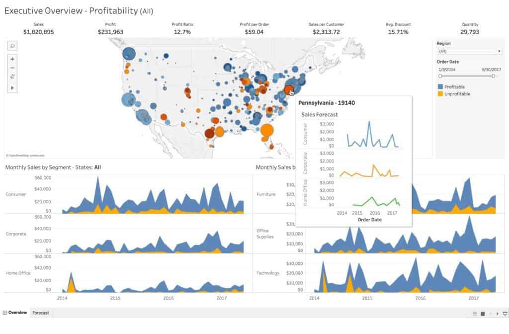
With its advanced functions (and slightly higher pricing) Tableau one of the great tools for big data crunching.
As you could see from these examples, data visualization platforms have many advantages, namely:
- Integrations of data sources
- Dashboard templated
- Change the data visualization on the go
- Computing speed
- Acceptable prices
- High-level data view
Free Data Visualization Tools
Here are a couple of example of data visualization tools that allow you not only to have a trial version, but actually use the platform for free.
Sure, there are some limitations but if you are just entering the data visualization space, those free packages might be enough to cover all your needs:
- Databox
- Infogram
What Do You Need in a Good Data Visualization Tool?
If you read the whole post, you might have caught the phrase “unknown unknown”. Those are the things you did not know you do not know.
While we establish that data visualization can show you critical info that you were not even aware you should look for, now let’s discuss what should you look for in your data tools to make the best use of it.
Integrations
Chances are, you are getting your data from somewhere. Salesforce, SugarCRM, Hubspot, Marketo, etc.
Now you need to work with the data from one app, or maybe even combine data from various apps.
If this is the case, make sure that the tool of your choice will allow you to integrate other apps that you are using.
Ease Of Use
Free packages and trials are a great way to get acquainted with the program. For example, you might get overwhelmed by the features that Tableau offers and may rather try Databox or Zoho.
The main point is – the functions must be intuitive so you do not get lost in all the menus. So make sure that the interface of your data visualization tool fits you well.
Exports
You are getting the tools to present the visualization that it creates, so check if the exported final file is to your liking.
Maybe you need to embed it on your webpages, or you want to put a link once in your presentation and let the tool automatically update your presentation whenever the data changes.
Scalability
In the beginning, you can try a cheaper option that will fit all your needs, but make sure that the pricier packages allow you to scale.
After you used a particular visualization tool for a year and have it embedded everywhere, you really do not want to switch to a new one.
Team
It is probable that you will want to have several users on the platform, so you can share the data and work on a project together.
Check whether this is available and if you can set admin/editor rights to make sure that your data is really safe.
Summary
Noawadays if your business is not moving, it is dying. All your competitors are slowly but surely leveraging the data visualization tools to their advantage. There is nothing else left to do than to start analysing and arranging your data to find hidden patterns too.
Just a few years ago, data visualization tools were reserved for big corporations.
The cost was in five or six figures. To install and run it you had to keep a dedicated IT team. So a small or a mid-size business could not afford this.
Today, you can have same functionalities as the globabl corporations with as low as $40 per month.
The goal of any business is to grow. Proper data analytics and visualizations are the roadmaps that will help you mark your future path.
If you are looking for data visualization tools you might also be interested in my posts on marketing attribution, and marketing intelligence.
FAQ
Which tool is best for data visualization?
This is very individual, depending on your needs. The list may include Databox, Infogram, Tableau, and others from my list.
What is the easiest data visualization tool to use?
All of the modern tools are simple to use. Databox would be a good example, for others check the first part of the post.
Is Excel a data visualization tool?
Yes, but only with very basic functions. You may miss a lot of critical information by using an insufficient tool.
Is there a free data visualization tool?
Yes. There are some programming packages that you can further develop or use a free package of some of the data visualization platforms.
What are the benefits of data visualization?
It will enable you to see trends, patters and correlations that were previously hidden from you and you did not even know that they could exist.
What is the best way to present data?
Through a visualization. Humans tend to more easily absorb colors and images, rather than rows and columns of raw data.